Last week Utah’s More Than a Flag Task Force unveiled the final state flag design that will be presented to the Utah Legislature during the 2023 general legislative session for a vote.
This updated flag is a little masculine for my taste and a little too predictable in terms of color combinations (Utah vs. BYU?). But it is iconic (mountains, beehive, etc.), and I’m confident my day-to-day life will not be affected negatively, or in any way, by this new look.
Not everyone feels that way, however. A few people who chimed in on social media seem a tad more passionate about the change than I do.
Some like it.
Some, do not.
“The 8-point star is a symbol of Babylonia goddess Ishtar. ... Scrap this right now,” one person wrote in response to Gov. Spencer Cox’s Instagram post revealing the design. “Welcome to New Arizrado,” someone wrote on Facebook.
“This flag is Basic and means Absolutely nothing. There is no patriotism in this flag,” another posted, without explaining their capitalization choices.
“That looks like an emotionless, cold, socialist flag that manages to make a beehive look like a prison and our picturesque mountains into some jagged blades of doom all residing over a lake of blood,” someone else wrote.
It’s a vivid description, I’ll give them that.
But I have a message for the residents who believe the new flag is a sign of the occult or the worst thing to ever happen to them, personally: I promise it could be so much worse.
In our nation of 50 states, most of the flags are unhinged, at best.
Take, for example, Kansas:
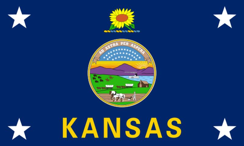
This is the screen that appears when you win Oregon Trail. I assume. I’ve never actually won because I always tried to save money by forging the river and ended up drowning the whole family due to a very heavy wagon full of buffalo meat. :(
Ad astra per aspera translates to “through hardships to the stars.” And here I thought the Heaven’s Gate group had been headquartered in California.
And then there’s Iowa:
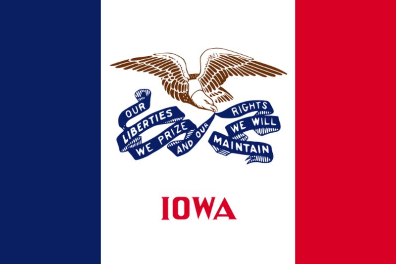
“Our rights liberties we will we prize and our maintain,” is how I read that.
Illinois’ is a variation on the same theme, but somehow worse:
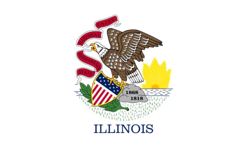
What’s with the artichoke? And asking anyone to read “sovereignty” upside down is asking too much, in my opinion.
I have to admit Idaho’s flag is pretty metal:
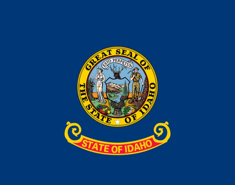
But I imagine the disembodied buck and expressionless man with a pickaxe have haunted the dreams of most of the state’s children.
Hawaii’s flag suggests they were not told that we fought in, and won (USA! USA!), the Revolutionary War:
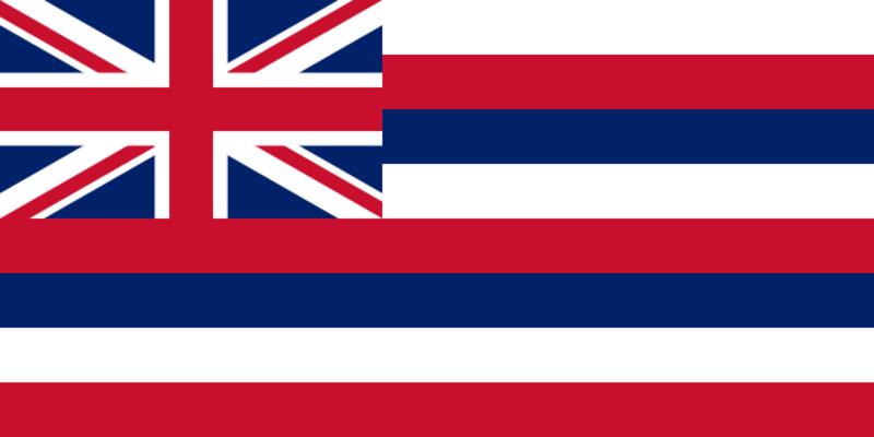
It also reminds me of a shirt my dad made in his high school home economics class. He used plaid for his first sewing project. It was not a success.
Virginia, on the other hand, seems a little too eager to remind everyone of the outcome of England v. the colonies.
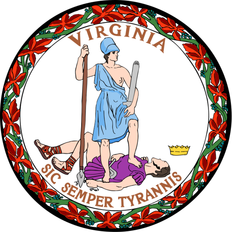
Also, isn’t “sic semper tyrannis” the Latin phrase infamously yelled by John Wilkes Booth? Yikes.
New Jersey's flag is another image from a fever dream:
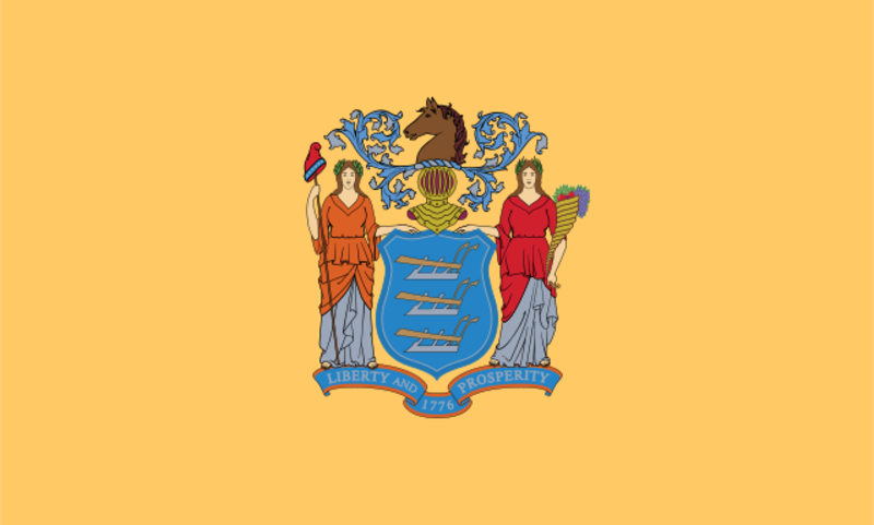
I’m concerned they murdered Waldo and have placed his hat on a stake to warn other nerds with a propensity for hiding in large crowds against doing so. And that’s for sure the horse head found in the bed in “The Godfather.” It’s on theme for Jersey, but morbid nonetheless.
Kentucky’s flag might be a visual ode to slow dancing:
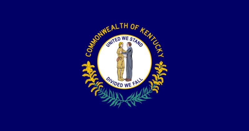
There’s nothing wrong with slow dancing, obviously. I love it. Just keep something that special where it belongs — in high school gyms and cruise ships. Don’t desecrate the slow dance by flying it on a flag. (One time in high school I was slow dancing with a guy and I got a violent, bloody nose. Luckily a janitor saw me and rushed me to an office and fetched me some tissues and that man will forever be my hero. This has nothing to do with Kentucky.)
But there is no flag more deranged, more befuddling, or more of an assault to the eyes than Maryland’s:
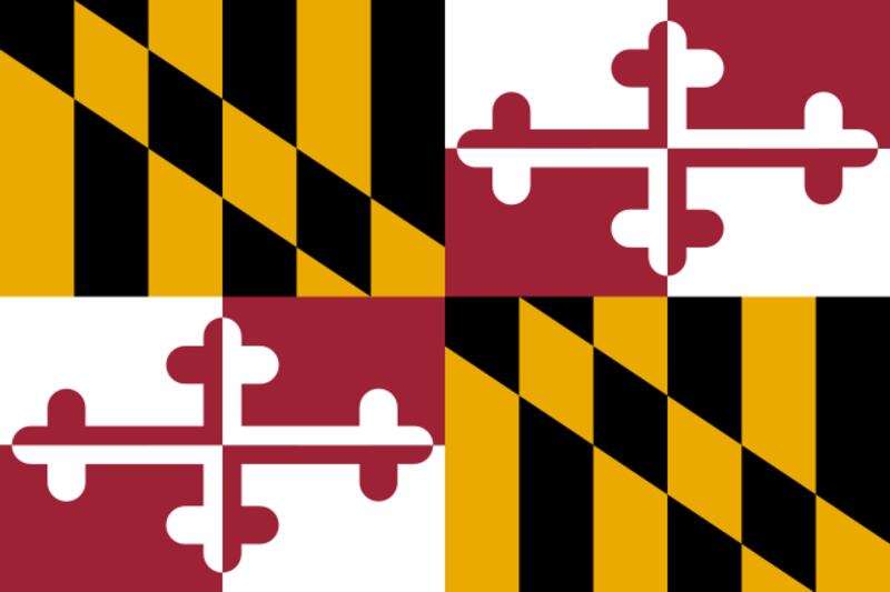
In fifth grade, which was the late ’90s, our well-intentioned computer teacher introduced my class to PowerPoint and instructed us to create a PowerPoint presentation on the subject of our choosing (I chose crocodiles of the Nile). I don’t know which of my classmates first discovered slide transitions, but I know that within minutes of the discovery we were adding the most elaborate transitions available in the software between each of our barely-filled-out slides.
The majority of our presentations were fade-ins, fade-outs, dissolved dots and twirling stock photos. One of my slides read “Crocodiles have shorter snouts and bigger bodies than alligators.” Then the slide broke into four sections with pieces of the next slide (crocodiles eat insects, fish, small frogs, lizards and small mammals) occupying the second and third boxes.
The Maryland flag looks almost exactly like that moment in my crocodile PowerPoint.
Our new flag could be better. It could be softer on the edges. It could be a red that better represents our southern landscape and a blue that hearkens to the skies on the best of skiing days. It could be a giant Swig cup or a fry sticking out of a vat of sauce and it would better represent our people.
But remember, Utahns, it could be worse. Much worse.


