

The verdict is in.
And the new symbol of The Church of Jesus Christ of Latter-day Saints is a hit.
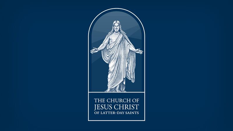
For one thing, the image of the Christus has eliminated that age-old question that adhered to the Angel Moroni logo: “Who is that?”
I know two sisters in Brigham City who stopped speaking to each other when the grandchildren of one sister asked who the figure was on top of the temple and she told them, “Your aunt Juanita.”
Of course, I’ve heard that some people are concerned that the Christus on the symbol was designed by Bertel Thorvaldsen, a Lutheran from Denmark.
But I say that makes a nice fit with the Restoration.
For Joseph Smith “creating” was often about “assembling.” When God created the earth, he organized it out of existing matter.
When Joseph restored the church, he used a few hymns from the Methodist and Catholic traditions, chose a version of the Bible created by Church of England scholars and even adapted the pulpits, pews and choir seats that the Protestants favored.
So using a Christus created by a Lutheran makes perfect sense.
After all, a “collage” is also a one-of-a-kind creation.
As for the doorway — the arch — over the image of the Christus in the symbol, my guess is it was based on some historical arch.
And those subtle blues and blue-grays that curve and recede behind the shoulders of the Savior?
I think I saw them just the other day — down by Alpine. In the evening, if you look east there, you can see the Wasatch Mountains layered in blues and grays in the distance.
That last notion was just my speculation, of course. Still, I do like the idea of the Savior being shown setting foot in Utah.
And I like the way the symbol (logo? emblem?) is depicted simply, reverently and subtly.
It makes me want to know which artist — or group of artists — designed it.
My guess is, however, we’ll never know.
Unlike a lot of modern art, religious art is not about the artist.
It’s about the artist’s subject matter.
Email: jerjohn@deseretnews.com