

The public opinion of the new Utah Mammoth logo seems largely positive (with some exceptions, as there always are). But did you notice all the Easter eggs hidden in it?
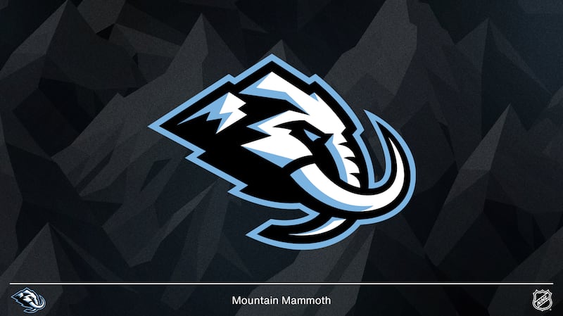
The snow cap on the left side of the logo is shaped like the state of Utah. The jagged lines underneath it form an “M” for “Mammoth.”
The tusk is shaped like a “U.” This was intentional — it stands for “Utah.”
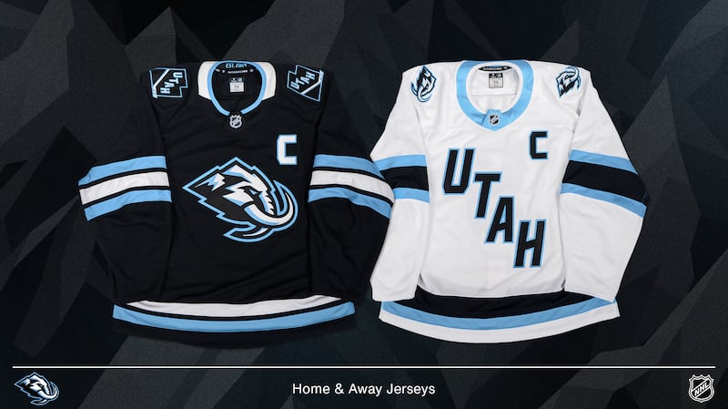
An additional nod to the franchise’s history, whether it classifies as an Easter egg or not, is the “Est. 2024″ marking on the inside of the collar. If there was any doubt before, there shouldn’t be now: This is a distinct team from the Arizona Coyotes.
The team also mentioned that the name has hidden meaning in and of itself. The dictionary offers two meanings for the word “mammoth” — one refers to the animal and the other is “of very great size.”
According to the team, it’s intended to represent “strength, momentum and an earth-shattering presence” and pay homage to the “boldness with which (the franchise) entered the league.”
The singularity of the name was also intentional. It’s meant to show unity.
Which other NHL teams have Easter eggs in their logos?
The Mammoth are far from the only team with Easter eggs in their logo. It would be impractical to list them all, but here are a few.
Minnesota Wild
I don’t care to admit how long it took me to realize that the Minnesota Wild logo is more than just a wilderness scene — it’s also the head of a bear.
Maybe you realized that the first time you saw it. Apparently some people do. But did you know that the bear’s mouth is in the shape of Minnesota’s state bird, the loon? Or that the star-shaped eye of the bear is a nod to the former Minnesota North Stars?
It’s a masterpiece.
Carolina Hurricanes
This one is simple but excellent: The negative space between the two flags on the Carolina Hurricanes’ black jersey forms the shape of North Carolina.
New York Islanders
The original New York Islanders logo wasn’t much different than the current one, but a keen eye will notice that the number of stripes on the hockey stick increased from three to four.
This represents the four times the Islanders won the Stanley Cup in the 1980s.
Some also say the tip of the “I” points to Uniondale, where their original arena, Nassau Coliseum, is located. It seems a little off the mark to me, but maybe I’m wrong.
Seattle Kraken
At first glance, the Seattle Kraken’s secondary logo is nothing more than an anchor. But when you look closer, you might realize the top takes the shape of the city’s most recognizable landmark: the Space Needle.